Van Westendorp Price Sensitivity Meter
The Price Sensitivity Meter (PSM) helps determine the psychologically acceptable range of prices for a single product or service. It is a frequently used pricing research method proposed by the economist Peter van Westendorp in the 1970s. It is particularly useful when:
- You want to assess what price range the market considers to be fair for your product.
- Your product is the only such product on the market or the number of competitive offerings is very large.
- You need quick, directionally correct results.
Using Van Westendorp to check if pricing is too high for the target market.
Each respondent is asked four questions on the price perception in Van Westendorp survey.
Van Westendorp surveys can be automatically translated to more than 30 languages.
Bring your own respondents or buy quality-assured panel respondents from us.
Main outputs of Van Westendorp
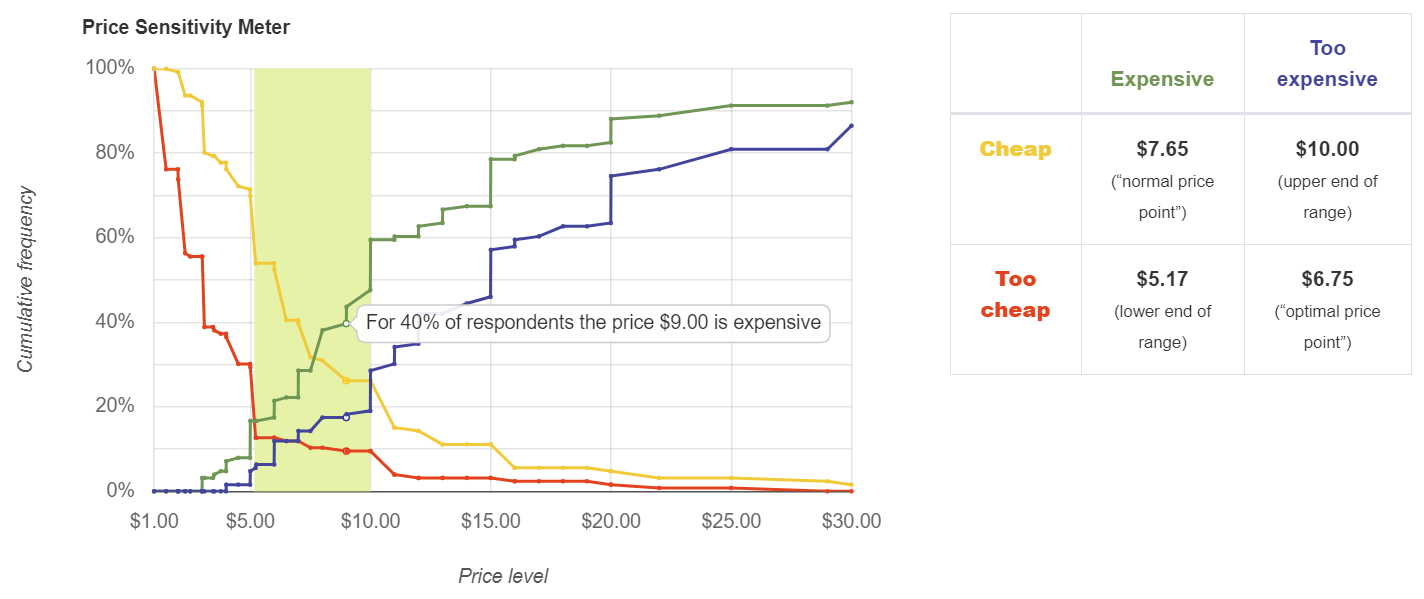
Price Sensitivity Meter (PSM)
The PSM is a chart of four lines with four intersections. The range between the leftmost intersection (of the lines “too cheap” and “expensive”) and the rightmost intersection (of the lines “cheap” and “too expensive”) is the psychologically acceptable range of prices.
For example, this chart suggests that the acceptable range of prices is $5 to $10, with the so-called "optimal" price of $6.75.
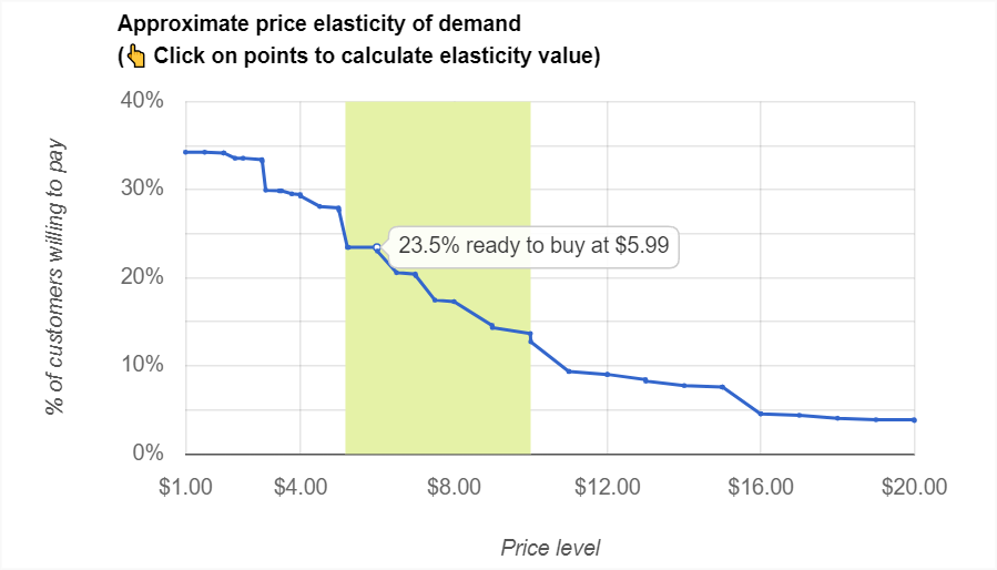
Price elasticity chart
Conjointly also provides Newton, Miller and Smith’s extension, which charts an approximated price elasticity of demand curve. The steeper the demand curve, the more price-sensitive customers are in relation to this product.
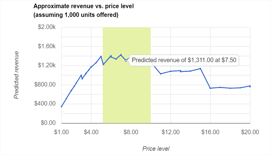
Revenue vs. price chart
Newton, Miller and Smith’s extension also models the approximate “revenue vs. price” curve, identifying revenue-maximising price points.
For example, this chart below suggests that the revenue-maximising price is around $10.
How it works
In this methodology, Conjointly will ask each respondent four questions on the perception of price, by asking at what prices respondents would consider the product:
- “Priced so low that you would feel the quality couldn’t be very good?” – to determine the “too cheap” price.
- “A bargain—a great buy for the money?” – to determine the “cheap” price.
- “Starting to get expensive, so that it is not out of the question, but you would have to give some thought to buying it?” – to determine the “expensive” price.
- “So expensive that you would not consider buying it?” – to determine the “too expensive” price.
The main output of the method is a chart of four intersecting lines. Each of these lines shows cumulative frequency for each of the four price levels across the respondents. The intersections of the four lines have the following interpretations:
- Intersection of “too cheap” and “expensive” is considered the lower end of the range of reasonable prices. It is also called “point of marginal cheapness”, or PMC.
- Intersection of “too cheap” and “too expensive” is called the “optimal price point”. This is the point at which an equal number of respondents describe the price as exceeding either their upper or lower limits. Optimal in this sense refers to the fact that there is an equal trade-off in extreme sensitivities to the price at both ends of the price spectrum.
- Intersection of “cheap” and “expensive” is called the “normal price point” or the “indifference price point”. This price point refers to the price at which an equal number of respondents rate the price point as either “cheap” or “expensive”.
- Intersection of “cheap” and “too expensive” is considered the upper end of the range of reasonable prices. It is also called “point of marginal expensiveness”, or PME. While in many pricing situations the theory that defines the “optimal” and “normal” price points is not compelling or applicable, the method does a reasonable job to help one understand the range of reasonable prices.
Check out the free Van Westendorp Excel Template to learn more. Or schedule a consultation with one of our experts to discuss your pricing projects!
Interpreting Newton, Miller and Smith’s extension
Even though the lines in the Price Sensitivity Meter chart look similar to elasticity curves, they are merely cumulative frequencies of responses, and do not show the amount of demand for any given price point. Newton, Miller and Smith proposed an extension to the PSM model, which helps address this issue.
This extension adds two 5-point scale questions that follow the Van Westendorp questions, asking about purchase likelihood at the prices the respondent has identified as “cheap” and “expensive”. We will then aggregate the respondents’ purchase likelihoods to construct (very approximate) elasticity curves and revenue charts.
The approximate price elasticity of demand chart is interpreted the same way as the conventional price elasticity of demand (PED), where the curve summarises the proportion of respondents willing to purchase the product across the price range. You can compute the PED between any two price points by clicking on the price points along the demand curve to understand how respondents would react to the price changes. The acceptable price range calculated from the PSM earlier is also highlighted in yellow for your reference.
The output also includes the approximate revenue vs. price chart based on the demand curve above. The revenue at any given price point is calculated using the formula Revenue = Price x % of respondents willing to pay at the price x 1000 units sold. This gives a simple indication of the revenue projection and allows you to identify the revenue-maximising price point. Similarly, the acceptable price range calculated from the PSM earlier is highlighted in yellow for your reference.
These outputs are similar to the outputs of Gabor-Granger pricing method, but their key differences lie in the approach and the calculation to produce the outputs. The Gabor-Granger explicitly asks respondents their purchase intention (i.e. yes or no) at multiple price points, and the aggregated data is the cumulative frequency of respondents who are willing to buy at the given price. On the other hand, the extension asks respondents their purchase likelihood based on two 5-point scale questions, and the aggregated data requires a bit more processing to compute cumulative frequencies. Whether to use Van Westendorp PSM or Gabor-Granger depends on your research objective, you can check out the guide on difference between the two methodologies.
If you would like to know more about the calculation of Van Westendorp PSM and Newton, Miller and Smith's extension, please refer to the guide on the calculation.
Setting up on Conjointly
There are a few things you will need to specify in Conjointly for this type of experiment:
- Whether you want to have a qualifying question (to screen out respondents who would not be in the market for this particular product). We recommend including this question.
- Whether you want to customise the text of the four PSM questions.
- The range of applicable prices for validation of responses. We strongly encourage you to keep it as wide as possible, and set the minimum at $0. For example, even if you are investigating FMCG goods that typically cost $4 per item, you should set the range of prices from $0 to $50.
- Whether you want to enable Newton, Miller and Smith’s extension, which we also encourage you to do.
In Conjointly, Van Westendorp questions are available both as:
- A separate experiment, and
- An additional question that can be added to conjoint, Gabor-Granger, or another survey.
You can add as many PSM exercises in a single experiment as you like.

Applications and limitations
The PSM is a great method to get exploratory results on the acceptable range of prices. It reveals attitudes people have about price points and where those attitudes might create hurdles that your company might have to overcome.
Because PSM is a “direct” pricing technique (where we ask respondents directly to name various prices), it is not appropriate in some situations, such as:
- In the case of entirely new products, where people have not yet formed a view of reasonable prices.
- In cases where there is in fact no such thing as “too cheap”. For example, add-ons to a software product can be priced at $0 and still be considered credible by virtue of paying for the main product.
PSM is often criticised as lacking solid theoretical foundation and history of predictive success (which is not the case for conjoint analysis, a more robust and proven method). In particular, we encourage you to consider the following:
- PSM asks about price of a single product in isolation from other characteristics of the product and competitive brands.
- Because it is a “direct” pricing technique, respondents are prone to underestimating the price levels they specify.
- The “optimal” and “normal” price points do not necessarily optimise for profit, volume, or revenue.
Resolving confusion from original paper
There is, at times, confusion regarding the charting of PSM plots, which stems from an original paper by Peter van Westendorp (see Figure 5: NSS Price-sensitivity Measurement Electric Razors) , in which the author proposed to:
- Use the inverse of "cheap" (i.e. "not cheap") instead of "expensive" curve
- Use the inverse of "expensive" (i.e. "not expensive") instead of "cheap" curve

Underneath the right-hand-side version of the plot, the following commentary was given:
At the point of marginal cheapness a price is given, where the number of people which experiences a product as “too cheap” is larger than the number which experiences it merely as cheap. Mutatis mutandis the same thing happens at the point of marginal expensiveness: the number of people experiencing the product as “too expensive” is larger than the number of those experiencing the product merely as expensive.
However, this commentary is incorrect because:
- The point identified in the paper as "Point of Marginal Cheapness" does not represent the number of people which experiences a product as “too cheap” is larger than the number which experiences it merely as cheap. In fact, it represents the number of people who experience a product as “too cheap” is larger than the number who do not experience it merely as cheap;
- Similarly, the incorrectly identified "Point of Marginal Expensiveness" does not represent the number of people experiencing the product as “too expensive” is larger than the number of those experiencing the product merely as expensive. Instead, it represents the number of people who experience a product as “too expensive” is larger than the number who do not experience it merely as expensive.
The effect of the inversions is to make the acceptable price range wider, diminishing its usefulness in practical applications. Needless to say, the inversions confuse an already complicated chart and make interpretation of the intersections murkier. Conjointly therefore follows the more commonly accepted approach in the market research industry of using non-inverted cumulative frequencies lines. If you still have any questions about the interpretation and the use of correct lines, we will be happy to discuss your research with you.
Complete solution for pricing research
Fully-functional online survey tool with various question types, logic, randomisation, and reporting for unlimited number of responses and surveys.
Efficiently test up to 300 product claims on customer appeal, fit with brand, and diagnostic questions of your choice.
Efficiently test product concepts to identify the best one for your business
Identify winning product variants from up to 300 different ideas (e.g., designs, materials, bundle options) on customer appeal, fit with brand, and diagnostic questions of your choice.
Efficiently test product descriptions to identify the best one for your product
Efficiently screen product ideas to identify the best one for your business
Feature and claim selection and measuring willingness to pay for features for a single product.
MaxDiff (aka Maximum Difference Scaling or Best–Worst Scaling) is a statistical technique that creates a robust ranking of different items, such as product features.
Efficiently test packages to identify the best one for your product
Pricing, feature and claim selection in markets where product characteristics vary across brands, SKUs, or price tiers.
Perform focussed comparisons between two items to determine which performs better.
Ask respondents to evaluate product concepts and digital assets one-by-one to get a read of their preferences and perceptions with various question types.
Efficiently evaluate potential business names to identify the best one to represent your brand
Efficiently test potential image ads to identify the best one for your business
Efficiently test ad copy to identify the best one for your brand
Efficiently test potential brand names to identify the best one to represent your business
Efficiently test print ads to identify the best one for your campaign
Efficiently test potential product names to identify the best one to reflect your brand
Test the effectiveness of your videos in an online environment
Efficiently test potential logos to identify the best one for your brand
Efficiently test out-of-home ads to identify the best one for your campaign
Efficiently test potential domain names to identify the perfect new home for your brand
Efficiently test potential business card designs to identify the best one for your business
Efficiently test potential NFT artwork to identify the best one for the marketplace
Efficiently test product concepts with Market Test
Efficiently test graphic designs with Market Test
Efficiently test graphic designs to identify the best one for your brand
Determine price elasticity for a single product and identify revenue-maximising price level.
Efficiently test potential brand names with Market Test
Efficiently test potential domain names with Market Test
The Price Sensitivity Meter helps determine psychologically acceptable range of prices for a single product and approximately estimate price elasticity.
Conduct automated TURF analysis on results of any Conjointly experiment (or an outside dataset) using this user-friendly TURF analysis tool.
Efficiently test potential logos with Market Test
Efficiently test ad copy with Market Test
Efficiently evaluate potential business names with Market Test
Efficiently test potential image ads with Market Test
Test pricing of new and existing consumer goods in a competitive context using elasticity charts, revenue, and profitability projections.
Efficiently test potential business card designs with Market Test
Ensure product-market fit and maximise your user acquisition and expansion, by differentiating software features according to your users' needs.
Efficiently test potential product names with Market Test
Efficiently test print ads with Market Test
Efficiently test product descriptions with Market Test
Efficiently screen product ideas with Market Test
Efficiently test out-of-home ads with Market Test
Efficiently test packages with Market Test
Efficiently test potential NFT artwork with Market Test